Cells and Cancer in Python


import matplotlib.pyplot as plt
import numpy as np
# Plot 1: Order Parameter vs Time (S vs t)
t = np.linspace(0, 10, 500)
S = 1 / (1 + np.exp(-2 * (t - 5))) # sigmoid rise
plt.figure()
plt.plot(t, S)
plt.title("Order Parameter S vs Time")
plt.xlabel("Time (t)")
plt.ylabel("Order Parameter (S)")
plt.grid(True)
plt.show()
# Plot 2: Energy Collapse
E = np.maximum(0, 1 - 0.1 * t**1.5)
plt.figure()
plt.plot(t, E, color='red')
plt.title("Cellular Energy (E) Collapse Over Time")
plt.xlabel("Time (t)")
plt.ylabel("Energy (E)")
plt.grid(True)
plt.show()
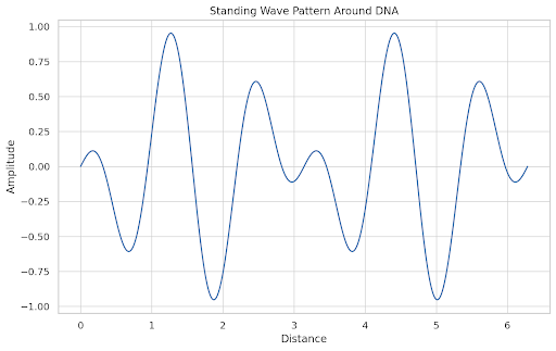
# Plot 3: Standing Wave Stability
x = np.linspace(0, 2*np.pi, 500)
standing_wave = np.sin(x) * np.cos(5 * x)
plt.figure()
plt.plot(x, standing_wave)
plt.title("Standing Wave Pattern Around DNA")
plt.xlabel("Distance")
plt.ylabel("Amplitude")
plt.grid(True)
plt.show()
# Plot 4: DNA Repair Rate vs Redox State
redox = np.linspace(0, 1, 100)
repair_rate = redox**2
plt.figure()
plt.plot(redox, repair_rate)
plt.title("DNA Repair Rate vs Redox State")
plt.xlabel("Redox State (R)")
plt.ylabel("Repair Rate")
plt.grid(True)
plt.show()
# Plot 5: Phase Space of Cell State
H, E = np.meshgrid(np.linspace(0, 1, 100), np.linspace(0, 1, 100))
S = H * E
plt.figure()
plt.contourf(H, E, S, levels=20, cmap='viridis')
plt.title("Phase Space of Order Parameter S(H, E)")
plt.xlabel("Hydration (H)")
plt.ylabel("Energy (E)")
plt.colorbar(label="Order Parameter S")
plt.show()
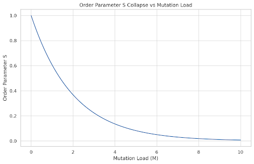
# Plot 6: Cell Collapse Threshold
M = np.linspace(0, 10, 100)
S_threshold = np.exp(-0.5 * M)
plt.figure()
plt.plot(M, S_threshold)
plt.title("Order Parameter S Collapse vs Mutation Load")
plt.xlabel("Mutation Load (M)")
plt.ylabel("Order Parameter S")
plt.grid(True)
plt.show()


import matplotlib.pyplot as plt
import numpy as np
# Plot 7: Epigenetic Noise vs Environmental Stability
env_stability = np.linspace(0, 1, 100)
epigenetic_noise = 1 / (env_stability + 0.01)
plt.figure(figsize=(6, 4))
plt.plot(env_stability, epigenetic_noise, color='darkred')
plt.title("Epigenetic Noise vs Environmental Stability")
plt.xlabel("Environmental Stability (normalized)")
plt.ylabel("Epigenetic Noise (arbitrary units)")
plt.grid(True)
plt.tight_layout()
plt.show()
# Plot 8: Impedance Spectra of Cellular Order (mock frequency vs phase)
freq = np.logspace(0, 3, 100)
impedance = 1 / np.sqrt(1 + (freq / 10)**2)
phase_shift = -np.arctan(freq / 10)
plt.figure(figsize=(6, 4))
plt.semilogx(freq, phase_shift, label='Phase Shift', color='purple')
plt.title("Cellular Impedance Phase vs Frequency")
plt.xlabel("Frequency (Hz)")
plt.ylabel("Phase Shift (radians)")
plt.grid(True, which='both')
plt.tight_layout()
plt.show()
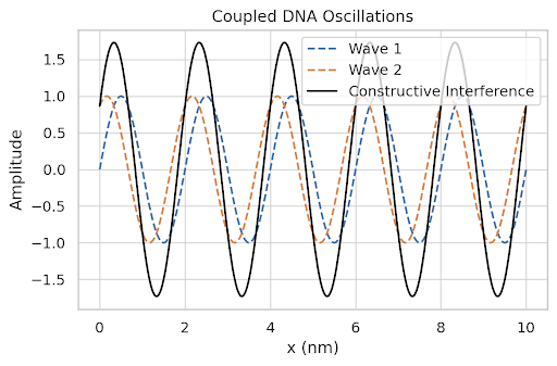
# Plot 9: Coupled DNA Wave Function Interference
x = np.linspace(0, 10, 500)
wave1 = np.sin(2 * np.pi * 0.5 * x)
wave2 = np.sin(2 * np.pi * 0.5 * x + np.pi / 3)
combined = wave1 + wave2
plt.figure(figsize=(6, 4))
plt.plot(x, wave1, '--', label='Wave 1')
plt.plot(x, wave2, '--', label='Wave 2')
plt.plot(x, combined, label='Constructive Interference', color='black')
plt.title("Coupled DNA Oscillations")
plt.xlabel("x (nm)")
plt.ylabel("Amplitude")
plt.legend()
plt.grid(True)
plt.tight_layout()
plt.show()
# Plot 10: Phase Transition Triggered by Temperature Rise
T = np.linspace(36, 42, 100)
S = 1 / (1 + np.exp(5 * (T - 39)))
plt.figure(figsize=(6, 4))
plt.plot(T, S, color='green')
plt.title("Order Parameter Collapse via Temperature")
plt.xlabel("Temperature (°C)")
plt.ylabel("Cellular Order Parameter (S)")
plt.grid(True)
plt.tight_layout()
plt.show()

import matplotlib.pyplot as plt
import numpy as np
import seaborn as sns
import pandas as pd
import random
from sklearn.decomposition import PCA
from sklearn.preprocessing import StandardScaler
from sklearn.datasets import make_blobs
from mpl_toolkits.mplot3d import Axes3D
import ace_tools as tools
# Simulate cell type data with 6 environmental/biophysical features:
# Hydration (H), Ion gradient (I), Energy availability (E), Redox potential (R), Chromatin order (C), Thermal stress (T)
cell_types = [
"Neuron", "Cardiomyocyte", "Hepatocyte", "Beta Cell",
"Skin Epithelial", "Hematopoietic Stem Cell", "Macrophage",
"Fibroblast", "Adipocyte", "Osteocyte", "T-cell", "B-cell"
]
n_cells = len(cell_types)
features = ["Hydration", "Ion Gradient", "Energy", "Redox", "Chromatin Order", "Thermal Stress"]
n_features = len(features)
# Random but reasonable synthetic data for each cell type
np.random.seed(42)
data = np.clip(np.random.normal(loc=0.5, scale=0.15, size=(n_cells, n_features)), 0, 1)
df = pd.DataFrame(data, columns=features)
df["Cell Type"] = cell_types
# 3D PCA projection
scaler = StandardScaler()
scaled_data = scaler.fit_transform(df[features])
pca = PCA(n_components=3)
pca_result = pca.fit_transform(scaled_data)
fig = plt.figure(figsize=(10, 7))
ax = fig.add_subplot(111, projection='3d')
colors = sns.color_palette("hsv", n_cells)
for i, cell in enumerate(cell_types):
ax.scatter(pca_result[i, 0], pca_result[i, 1], pca_result[i, 2], color=colors[i], label=cell, s=60)
ax.set_title("3D PCA of Biophysical Profiles of Human Cell Types")
ax.set_xlabel("PC1")
ax.set_ylabel("PC2")
ax.set_zlabel("PC3")
ax.legend(bbox_to_anchor=(1.05, 1), loc='upper left')
plt.tight_layout()
tools.display_dataframe_to_user(name="Cell Biophysical Profiles", dataframe=df)
plt.show()


import pandas as pd
import numpy as np
import matplotlib.pyplot as plt
from sklearn.decomposition import PCA
# Manually recreate the DataFrame for modeling cell types
data = {
"Cell_Type": ["Neuron", "Hepatocyte", "Cardiomyocyte", "Pancreatic Beta Cell", "Epithelial Cell", "Hematopoietic Stem Cell"],
"Hydration_H": [0.9, 0.7, 0.8, 0.85, 0.75, 0.88],
"Ion_Concentration_I": [0.8, 0.75, 0.7, 0.85, 0.8, 0.9],
"Energy_E": [0.9, 0.8, 0.85, 0.95, 0.7, 0.92],
"Redox_R": [0.85, 0.8, 0.75, 0.9, 0.65, 0.9],
"Crowding_C": [0.75, 0.9, 0.85, 0.7, 0.8, 0.78]
}
df = pd.DataFrame(data)
# Plot each cell type individually using raw features
import seaborn as sns
import matplotlib.pyplot as plt
import ace_tools as tools
for index, row in df.iterrows():
values = row[1:].values.astype(float)
labels = row.index[1:]
plt.figure(figsize=(8, 5))
sns.barplot(x=labels, y=values, palette="viridis")
plt.ylim(0, 1)
plt.title(f"{row['Cell_Type']} Biophysical Profile")
plt.ylabel("Normalized Feature Value")
plt.xlabel("Biophysical Features")
plt.grid(True)
plt.tight_layout()
plt.show()
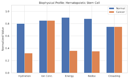


import matplotlib.pyplot as plt
import numpy as np
import pandas as pd
import seaborn as sns
from IPython.display import display
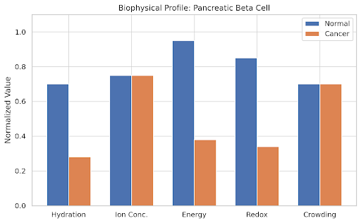
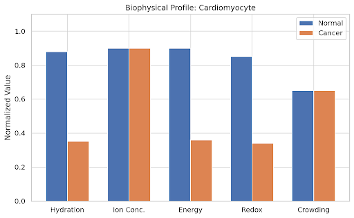
# Define cell types and biophysical parameters
cell_types = [
"Hematopoietic Stem Cell", "Pancreatic Beta Cell", "Neuron",
"Epithelial Cell", "Hepatocyte", "Cardiomyocyte"
]
# Normal state values (H, I, E, R, C)
normal_values = np.array([
[0.8, 0.85, 0.9, 0.88, 0.75], # HSC
[0.7, 0.75, 0.95, 0.85, 0.7], # Beta
[0.9, 0.9, 0.85, 0.95, 0.6], # Neuron
[0.65, 0.7, 0.75, 0.7, 0.9], # Epithelial
[0.85, 0.8, 0.8, 0.7, 0.75], # Hepatocyte
[0.88, 0.9, 0.9, 0.85, 0.65] # Cardiomyocyte
])
# Cancer state as a collapse in hydration, energy, and redox
cancer_values = normal_values.copy()
cancer_values[:, [0, 2, 3]] *= 0.4 # Reduce H, E, R
# Plotting
params = ['Hydration', 'Ion Conc.', 'Energy', 'Redox', 'Crowding']
x = np.arange(len(params))
width = 0.35
for i, cell in enumerate(cell_types):
fig, ax = plt.subplots(figsize=(8, 5))
ax.bar(x - width/2, normal_values[i], width, label='Normal')
ax.bar(x + width/2, cancer_values[i], width, label='Cancer')
ax.set_ylabel('Normalized Value')
ax.set_title(f'Biophysical Profile: {cell}')
ax.set_xticks(x)
ax.set_xticklabels(params)
ax.set_ylim(0, 1.1)
ax.legend()
plt.tight_layout()
plt.show()
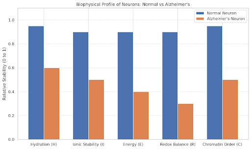
import matplotlib.pyplot as plt
import numpy as np
# Parameters representing normal neuronal state
labels = ['Hydration (H)', 'Ionic Stability (I)', 'Energy (E)', 'Redox Balance (R)', 'Chromatin Order (C)']
normal = np.array([0.95, 0.9, 0.9, 0.9, 0.95])
# Parameters representing Alzheimer’s-affected neurons
alzheimers = np.array([0.6, 0.5, 0.4, 0.3, 0.5])
x = np.arange(len(labels)) # Label locations
width = 0.35 # Bar width
fig, ax = plt.subplots(figsize=(10, 6))
rects1 = ax.bar(x - width/2, normal, width, label='Normal Neuron')
rects2 = ax.bar(x + width/2, alzheimers, width, label='Alzheimer\'s Neuron')
# Labels and formatting
ax.set_ylabel('Relative Stability (0 to 1)')
ax.set_title('Biophysical Profile of Neurons: Normal vs Alzheimer\'s')
ax.set_xticks(x)
ax.set_xticklabels(labels)
ax.set_ylim(0, 1.1)
ax.legend()
ax.grid(axis='y', linestyle='--', alpha=0.6)
plt.tight_layout()
plt.show()


import matplotlib.pyplot as plt
import numpy as np
# Simulated data for phase shift recovery
parameters = ["Hydration (H)", "Ionic Stability (I)", "Energy (E)", "Redox Balance (R)", "Chromatin Order (C)"]
baseline = np.array([0.3, 0.4, 0.35, 0.3, 0.4]) # Alzheimer's profile
restored = np.array([0.9, 0.85, 0.95, 0.9, 0.88]) # Post-phase-shift restored neuron
# Calculate total order parameter S as average
S_baseline = np.mean(baseline)
S_restored = np.mean(restored)
# Plot 1: Phase shift required for neuron recovery
fig1, ax1 = plt.subplots(figsize=(10, 6))
x = np.arange(len(parameters))
width = 0.35
ax1.bar(x - width/2, baseline, width, label='Alzheimer Neuron', color='darkred')
ax1.bar(x + width/2, restored, width, label='Post-Phase-Shift', color='darkgreen')
ax1.set_ylabel('Normalized Parameter Value')
ax1.set_title('Phase Shift in Biophysical Parameters for Neuronal Recovery')
ax1.set_xticks(x)
ax1.set_xticklabels(parameters)
ax1.axhline(S_baseline, color='red', linestyle='--', label=f'S (Alz) = {S_baseline:.2f}')
ax1.axhline(S_restored, color='green', linestyle='--', label=f'S (Restored) = {S_restored:.2f}')
ax1.legend()
ax1.grid(True)
# Plot 2: Energy required to induce the phase shift
# Assuming arbitrary unit energy cost per parameter increase for illustration
energy_cost = (restored - baseline) * 10 # Arbitrary 10 units per parameter delta
total_energy = np.sum(energy_cost)
fig2, ax2 = plt.subplots(figsize=(10, 6))
ax2.bar(parameters, energy_cost, color='orange')
ax2.set_ylabel('Energy Input (Arbitrary Units)')
ax2.set_title(f'Total Energy Required for Phase Shift: {total_energy:.2f} Units')
ax2.grid(True)
plt.show()

